Published On Mar 22, 2021
Want me to coach/mentor/advise you in your project management career? This link shows you how: https://influentialpmo.com/1-to-1-adv...
Want to join me for group Zoom calls? Join the membership space here: / influentialpmo
#projectmanagement
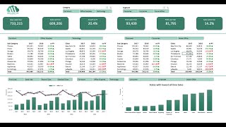
A video showing how to create useful charts to see team skills (and skill gaps) in Excel. This builds on the Excel tutorial for creating a skills matrix in the previous video, which can be found here: • Making a Skills Matrix for your Team ...
This demonstrates the use of the vlookup function, the iferror function and the creation of Excel charts. All of this will be useful to managers that are interested in assessing the skills levels and skills gaps within their teams - either for the entire team or cohorts.
Timestamps:
0:00 - Intro
1:30 - Add team or cohort category by adding a column in Excel
3:01 - Create the Team worksheet in Excel
5:09 - Using the IfError function and Vlookup function in Excel
12:00 - Using the Average function in Excel
13:14 - Creating charts in Excel that are updated by our Vlookup data and team average scores - creating a radar chart in Excel
15:35 - Formatting charts in Excel
18:50 - Creating charts in Excel that are updated by our Vlookup data and team average scores - creating a column chart in Excel
24:11 - The benefit of simplicity
26:35 - Fixing common errors and problems
To download my copy of this template, sign up for the Influential PMO newsletter at: https://geni.us/skillsmatrix
#excel #team