Published On Apr 3, 2024
Check out my Free Line and Color Quick Start Guide: https://www.thedrawingcodex.com/quick... You will learn how to develop a simple reliable process in photoshop. You also get all the brushes and PSDs that I use in the guide (the same ones I use for most of my illustrations).
Let's do the final stage of our cover style illustration... The Color!
I spend a fair bit of time in the beginning going over the techniques I use in Photoshop to help speed up the selections.
This is Part 4 of a 4 Part tutorial.
Part1: • Nail Your Colour Scheme... With Thumb...
Part2: • Properly Construct Your Drawing: Cove...
Part3: • Get Emotion And Structure In Your Lin...
Part4: • Professional Line & Color Process: Co...
Here are some Automagically generated takeaways to help with search optimisation:
----
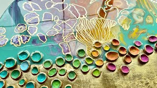
In the fourth instalment of this tutorial series, we reach the culminating phase where the groundwork laid in the first part—the creation of a color thumbnail—comes to fruition in the finished illustration. This segment is dedicated to the application of our analogous color scheme initially devised, a palette rooted in the harmonious interplay of yellows, greens, and blues, punctuated with strategic spikes of red and orange to introduce vibrancy and focus. This video covers the process of translating this color plan into the detailed, polished final artwork. We realize the potential of the initial color thumbnail, applying and adjusting the chosen colors to achieve a cohesive and impactful illustration.
In this video, I also delve into utilizing Photoshop actions to significantly speed up the flatting process, emphasizing efficiency and precision. This approach involves creating automated sequences that handle repetitive tasks, such as selecting and isolating different parts of the illustration. By refining selections with the pencil tool and leveraging actions for tasks like isolating objects for coloring, I demonstrate how to streamline the workflow, ensuring that every selection is precise and consistent. This method not only saves time but also maintains the high quality of the artwork by ensuring clean, clear separations between different elements.
The video underscores the critical role of a color thumbnail in establishing a coherent color scheme for an illustration. A well-crafted color thumbnail serves as a foundational guide, ensuring that the final artwork remains true to the envisioned aesthetic. However, I also advocate for the importance of creative experimentation within the boundaries of this initial plan. While the color thumbnail provides a solid starting point, experimenting with colors as the artwork progresses is vital for infusing the piece with complexity and depth. This balance between adherence to the initial color plan and openness to experimentation enriches the coloring process, allowing for a finished piece that is both cohesive and dynamically engaging.
----
Happy Drawing!
Tim Mcburnie
Learn Drawing and Illustration from me: www.thedrawingcodex.com
Portfolio: www.timmcburnie.com
www.artstation.com/tim-mcburnie
www.instagram.com/timmcburnie
twitter.com/timmcburnie